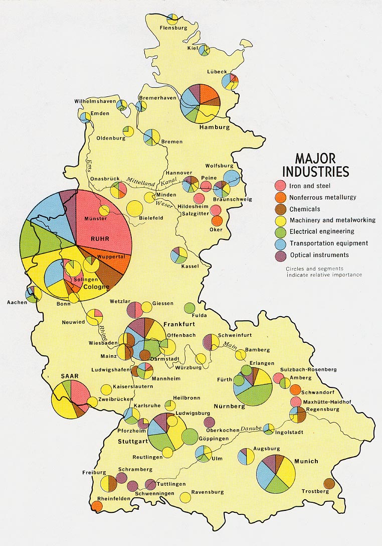
Here is an example of a proportional circle map. This map shows the different industries in Germany. Not only does it show where the industries are, it shows the different varieties of each industry.
Map found at: http://www.lib.utexas.edu/maps/europe/west_germany_ind_1972.jpg
Sunday, June 28, 2009
Choropleth maps
This is an image of a choroplethmap. This particular one shows the Hispanic culture in the state of Florida. The darker the color the more popular and intense the hispanic culture is in that one particular area. Chrorplethmaps are thematic. This map was used from data of the 2000 census.
Map found at: http://my.ilstu.edu/~jrcarter/Geo204/Choro/Tom/hispanic_race_fl-H1_FINAL.gif
Dot distribution maps
Here is an example of a dot distribution map. This particular dot distribution map was taken during the 2000 census. This map shows the US population, each dot equals 7,500 people. Dot distribution maps can be used to show military bases, poverty levels, age differences, single family homes, schools, race or any object in a certain area.
Subscribe to:
Posts (Atom)