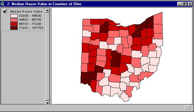
A Geography Information System (GIS) is a computer-based system made to display material referenced to the environment. GIS can be used for site remediation, natural resources management, groundwater modeling, vegetation mapping and more. GIS can also show different layers of data, as the one above is showing layers of monitoring wells, industries and population.
Monday, August 3, 2009
State Plane Coordinate System
Star plots
Star plots are used to graph all sorts of data that are relative to the same behavior of all variables in a multivariate data set. Star plots are created with "spokes" and each spoke has represents a different data. With all of the interconnecting spokes the chart looks like a start hinse the name "star plot."
Correlation matrix
Similarity matrix
Image found at: http://cgi.mtc.sri.com/Cluster-Lab/01.jpg
Stem and Leaf Plot
Stem and Leaf plots are used to organized numerical data. If this plot represented students in a class over the past 5 years the plot would read 22; 26;27;31;33;35 etc.
This type of plots is a good way to help children learn mathmatical problems. Image found at: http://www.highpointsmath.com/sitemap/images/clip_image004_017.jpg
Box plot
Image found at: http://math.youngzones.org/boxplot.gif
Histogram
Here is an example of a Histogram. Histograms display tabulated frequency. Histograms are a graphs that show statistics with vertical rectangles that stop accordingly to the information that is being disbursed.
Image found at:http://www.statcan.gc.ca/edu/power-pouvoir/ch9/images/histo1.gif
Parallel coordinate graph
This is an example of a parallel coordinate graph. This graph is used to visualize baseball statistics. Parallel coordinate graphs are used to plot large sets of data. Parallel coordinate plots can be used to explore relationships among variables.
Image found at: http://www.matthewtavares.com/baseball_report/graph_allteams.bmp
Triangular Plot
Wind Rose
Image found at: http://www.climate.washington.edu/windrose/Seattle-WindRose.jpg
Climograph
Image found at: http://www.washburn.edu/faculty/tfry/Climate%20article_files/image003.gif
Population profile
Scatter plot
Image found at: http://cnx.org/content/m10949/latest/age_scatterplot.gif
Index value plot
Accumulative line graph or Lorenz curve
Image found at: http://img.sparknotes.com/figures/D/df794916738a067d0a15bbaeabcb81e3/lorenz.gif
Bilateral graph
The left side of the graph shows the percentage rate at which the mortgage is fixed. Bilateral graphs show negative and positive values, and is made for the viewer to comprehend easily.
Image found at: http://www.680homes.com/blog/wp-content/rate-chart-april-07.jpg
Nominal area choropleth map
Image found at: http://politicalmaps.org/wp-content/uploads/2007/12/2008-prediction-map-11252007.jpg
Unstandardized choropleth maps
This is an example of an unstandardized choropleth map. This map type does not have specific rankings or order.
Image found at: http://www.epa.gov/oppt/rsei/images/thematic.jpg
Standardized choropleth maps
Image found at: http://www.statcan.gc.ca/pub/92f0138m/2008003/figures/figure3.1-en.jpg
Univariate choropleth maps
Here is an example of an univariate choropleth map. Univariate choropleth maps are used for single data information.
Image retrieved from: http://www.cdc.gov/pcd/issues/2007/oct/images/07_0091_01.gif
Bivariate choropleth maps
Unclassed choropleth maps
This is an unclassed choropleth map that shows fertility rates. An unclassed choropleth map using shadings to represent the data.
Image found at: http://www.esds.ac.uk/international/images/uchoropleth.gif
Saturday, August 1, 2009
Classed choropleth maps
DEM
A Digital Elevation Model (DEM) shows raised geographic data. The DEM above shows the elevations of Lake Tahoe. DEMs are used in xyz coordinates, and use contour lines.
Image found at: http://tahoe.usgs.gov/images/4ds/dem_dlg.gif
DRG
Here is an example of a digital raster graphic (DRG). This is a type of topographic map. DRG are used to collect, review and revise digital data.
Image found at: http://www.mi-drg.org/DRG-Freq-example.jpg
Friday, July 31, 2009
Isopach
Image found at: http://www.cartage.org.lb/en/themes/Sciences/Earthscience/Geology/OilandGas/HydrocarbonExploration/GeologicMaps/SANDSTONE_MAP.jpg
Isohyets
Image found at: http://soer.justice.tas.gov.au/2003/image/265/water%20quantity/m-ilw_quantity_rainfall-l.gif
Isotachs
Image found at: http://weather.cod.edu/help/700tach.gif
Isobars
Image found at:http://www.newmediastudio.org/DataDiscovery/Hurr_ED_Center/Hurr_Structure_Energetics/Closed_Isobars/Closed_Isobars_fig02.jpg
LIDAR
Image found at: http://www.imagingnotes.com/ee_assets/email_images/Lidar_KansasCity_MJHarden.jpg
Doppler radar
This is another one of my favorite types of images. I look for it everyday on the news. This is Doppler radar. Doppler radar mostly used to show thunderstorms and rain in ones area. It also shows where clouds are at, at a certain time. I like the Doppler radar because it shows how close rain is, and how sever the storms may be. Doppler radar is also a good estimate of how much time you have before a storm hits your area. This image shows that rain is close to the Fort Myers area, and the red indicates that the weather is very severe.
Image found at:
black and white aerial photo
Image found at:http://isaacalongi.com/wp-content/uploads/2008/11/black_and_white_aerial_photograph_of_kc.jpg
Infrared aerial photo

Infrared aerial photos are pictures of a product or land mass, the darker the colors, the more intense the area . In this case, this is an infrared aerial picture of a hurricane. The center of the hurricane (the eye) is red, and the dot in the very center is green, ...which means that these colors are the most intense area of the storm. There is also red in the outer layers of the hurricane, which shows that there are some intense storms beyond the center of the hurricane.
Cartographic Animations
Statistical maps
Map found at:http://personalpages.manchester.ac.uk/staff/m.dodge/cybergeography/atlas/mids_af_i_gr_c_large.gif
Tuesday, July 28, 2009
Cartograms
Map found at: http://www.amphibiaweb.org/amphibian/cartograms/cart_global_diversity.jpg
Tuesday, July 7, 2009
Flow Maps
Isoline maps
Here is an image of Isoline map. Isoline maps use lines that run together and show the same types of information within the lines, and often colors are used to show the differences in each section. This one shows the different temperatures of January's highs. starting at less than 40 degrees to greater than 32 degrees.
Map found at: http://miracmaps.blogspot.com/search?q=isoline+
Sunday, June 28, 2009
Proportional circle maps
Map found at: http://www.lib.utexas.edu/maps/europe/west_germany_ind_1972.jpg
Choropleth maps
Map found at: http://my.ilstu.edu/~jrcarter/Geo204/Choro/Tom/hispanic_race_fl-H1_FINAL.gif
Dot distribution maps
Monday, May 25, 2009
Propaganda Map
Hypsometric Map
This is an example of a hypsometric map. This shows the moons different geographic structures. A hyposemtric map is generally used to show different dimensions using shading and tinting.
Map found at: http://upload.wikimedia.org/wikipedia/commons/3/3b/Moon_worldwind.jpg
PLSS Map
PLSS is an abbreviation for Public Land Survey System, that shows images that are divided and owned by the government. These maps are used to show an area of township. These maps are also used to identify land parcels, titles, and deeds of rural land. This specific map shows the Western area of the United States specific parcels.
Map Found at: http://gis.nwcg.gov/giss_2006/job_aids/maps_and_graphics/USA_PLSS_Meridians_map.jpg
Cadastral Map
Map found at:
Thematic Map
This is an example of a thematic map. Thematic maps are used to reflect a particular theme about an area. Thematic maps can show, social, political, cultural, sociological, agricultural, education, economic details or any other aspects of an area, city, state, county, country or continent. This thematic map is showing the theme of population change in the United States, by the Bureau of the Census.
This map was found at:
Topographic map
This is an image of a topographic map; which is a type of map that represents natural and man-made landmarks. This is a topographic map that uses contour lines. This topographic map uses a large scale that is typically used in topographic maps, all though topographic maps can be used for a smaller scale.https://www1.nga.mil/ProductsServices/TopographicalTerrestrial/PublishingImages/350px-Topographic_map_example.png
Tuesday, May 19, 2009
Planimetric map
This is a Planimetric map. This type of map shows only horizontil positions; and it does not show verticle information. This map show sthe area of Lake George. This map shows street signs and specific places such as the Lake George Beach State Park. Notice that the map shows no heights, nor verticle dimension.
Map found at: http://www.nysgis.state.ny.us/mapssales/gifs/lakegeo.jpg
Friday, May 15, 2009
Mental Maps
This is a mental map. This map is made strictly for the user to understand; and appears to be hand drawn in a short time period. There are no keys, nor does this map show significant details. It seems as though this map is illustrating a town or village's center, but only the author of this map would truly know.
Map retrieved from : http://farm3.static.flickr.com/2300/2495257579_f1fc646bbe.jpg
Subscribe to:
Comments (Atom)


