Friday, July 31, 2009

Statistical maps

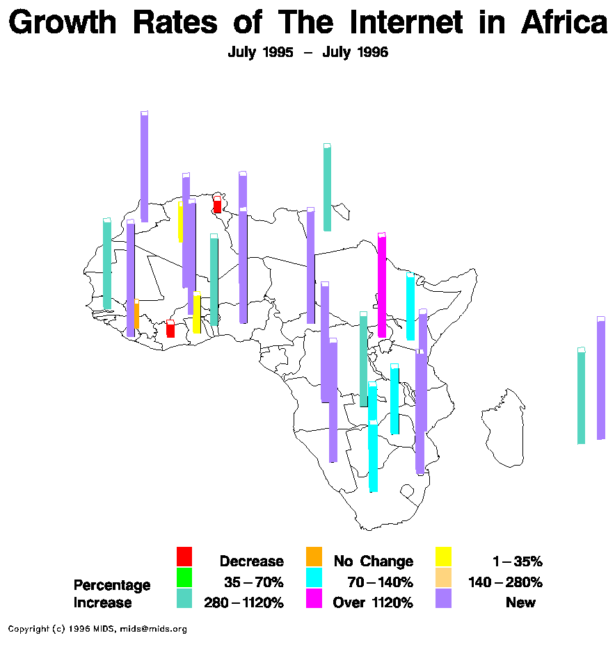
This is one of my favorite types of maps. Statistical maps, these are used to show statistics of various types. This one particular shows the percentage increases of Internet in Africa from July 1995-July 1996. The major growth was people and places that have newly received Internet access. Statistical maps can show any type of statistic in any area, some examples are college graduates, births, incomes, and pets.
Map found at:http://personalpages.manchester.ac.uk/staff/m.dodge/cybergeography/atlas/mids_af_i_gr_c_large.gif

Tuesday, July 28, 2009

Cartograms

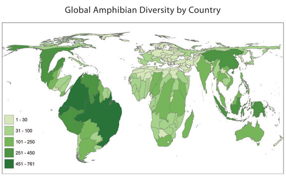
This is a cartogram of global amphibian diversity around the world. This is an illustration ofamphibian diversity and density. As the green color display darker, that shows that there are more amphibian in that particular area. Cartograms can be used to show a number of things across the world such as animal populations, emissions, census information, colleges and just about any thing.
Map found at: http://www.amphibiaweb.org/amphibian/cartograms/cart_global_diversity.jpg

Tuesday, July 7, 2009

Flow Maps

Flow maps are used to track different cases. In this case the map is showing the tracking of the West Nile virus. Flow maps can also be used to track immigration, politics (Democratic v. Republican), housing markets, test scores and much more.

Isoline maps


Here is an image of Isoline map. Isoline maps use lines that run together and show the same types of information within the lines, and often colors are used to show the differences in each section. This one shows the different temperatures of January's highs. starting at less than 40 degrees to greater than 32 degrees.

Sunday, June 28, 2009

Proportional circle maps

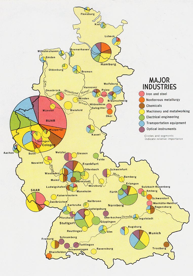
Here is an example of a proportional circle map. This map shows the different industries in Germany. Not only does it show where the industries are, it shows the different varieties of each industry.
Map found at: http://www.lib.utexas.edu/maps/europe/west_germany_ind_1972.jpg

Choropleth maps

This is an image of a choroplethmap. This particular one shows the Hispanic culture in the state of Florida. The darker the color the more popular and intense the hispanic culture is in that one particular area. Chrorplethmaps are thematic. This map was used from data of the 2000 census.
Map found at: http://my.ilstu.edu/~jrcarter/Geo204/Choro/Tom/hispanic_race_fl-H1_FINAL.gif

Dot distribution maps

Here is an example of a dot distribution map. This particular dot distribution map was taken during the 2000 census. This map shows the US population, each dot equals 7,500 people. Dot distribution maps can be used to show military bases, poverty levels, age differences, single family homes, schools, race or any object in a certain area.