Monday, August 3, 2009

Histogram


Here is an example of a Histogram. Histograms display tabulated frequency. Histograms are a graphs that show statistics with vertical rectangles that stop accordingly to the information that is being disbursed.
Image found at:http://www.statcan.gc.ca/edu/power-pouvoir/ch9/images/histo1.gif

Parallel coordinate graph


This is an example of a parallel coordinate graph. This graph is used to visualize baseball statistics. Parallel coordinate graphs are used to plot large sets of data. Parallel coordinate plots can be used to explore relationships among variables.

Triangular Plot


A triangular plot or also known as a Ternary plot, represents 3 different sets of related values. A ternary plot is a barycentric plot, on three variables as positions on a equilateral triangle.

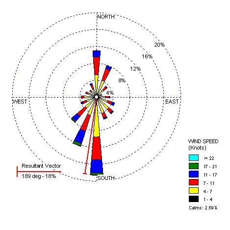
Wind Rose

A wind rose is used to show the different data regarding wind. Meteorologist generally use a wind rose to identify different wind speeds and direction in a specific area. A wind rose is also an example of a circular plot.
Image found at: http://www.climate.washington.edu/windrose/Seattle-WindRose.jpg

Climograph

A climograph is used to show information regarding climates. These type of graphs are helpful when trying to learn an areas environment.
Image found at: http://www.washburn.edu/faculty/tfry/Climate%20article_files/image003.gif

Population profile

This population profiel is showing the percent of immigrant population in the U.S. in 2004.
The two different colors are showing the differences in males and females. Colors can also be used for age, race, religion, income, and more.

Scatter plot

This scatter plot is comparing husband's and wife's ages. Scatter plots are often used to statistically describe a trend. Each observation is represented by a dot.
Image found at: http://cnx.org/content/m10949/latest/age_scatterplot.gif