Monday, August 3, 2009

GIS


A Geography Information System (GIS) is a computer-based system made to display material referenced to the environment. GIS can be used for site remediation, natural resources management, groundwater modeling, vegetation mapping and more. GIS can also show different layers of data, as the one above is showing layers of monitoring wells, industries and population.

State Plane Coordinate System


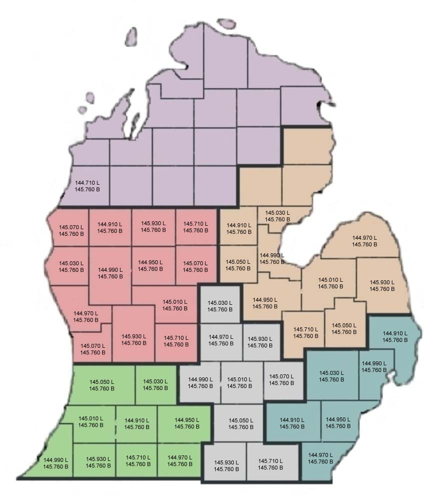
This is a type of rectangular coordinate system. State plane coordinate systems are used to show survey data. Each state has its own state plane coordinates according to their size. Each state has a different projection depending on the states size.

Star plots


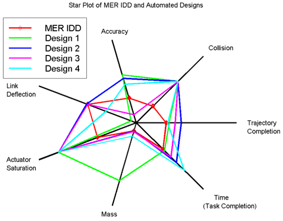
Star plots are used to graph all sorts of data that are relative to the same behavior of all variables in a multivariate data set. Star plots are created with "spokes" and each spoke has represents a different data. With all of the interconnecting spokes the chart looks like a start hinse the name "star plot."

Correlation matrix

A correlation matrix is used to give correlations between all pairs of a data set. Correlation matrix's are used to show statistics and relationships between two different types of variables. This correlation matrix is showing data regarding excess returns vs. an index.
Image found at:

Similarity matrix

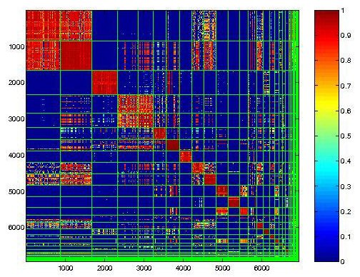
Here is an example of a similarity matrix. This type of graph shows similarity between two different types of data. All though they are not easy to read, they are good to use when compairing data. High scores are for similar data, and low scores are for more different data.
Image found at: http://cgi.mtc.sri.com/Cluster-Lab/01.jpg

Stem and Leaf Plot


Stem and Leaf plots are used to organized numerical data. If this plot represented students in a class over the past 5 years the plot would read 22; 26;27;31;33;35 etc.
This type of plots is a good way to help children learn mathmatical problems. Image found at: http://www.highpointsmath.com/sitemap/images/clip_image004_017.jpg

Box plot

Another type of statistical graph is a Box Plot. Box plots provide a simple graphical summary of a set of data. Box plots can handle large data sets, but do not share an exact retained value.
Image found at: http://math.youngzones.org/boxplot.gif

Histogram


Here is an example of a Histogram. Histograms display tabulated frequency. Histograms are a graphs that show statistics with vertical rectangles that stop accordingly to the information that is being disbursed.
Image found at:http://www.statcan.gc.ca/edu/power-pouvoir/ch9/images/histo1.gif

Parallel coordinate graph


This is an example of a parallel coordinate graph. This graph is used to visualize baseball statistics. Parallel coordinate graphs are used to plot large sets of data. Parallel coordinate plots can be used to explore relationships among variables.

Triangular Plot


A triangular plot or also known as a Ternary plot, represents 3 different sets of related values. A ternary plot is a barycentric plot, on three variables as positions on a equilateral triangle.

Wind Rose

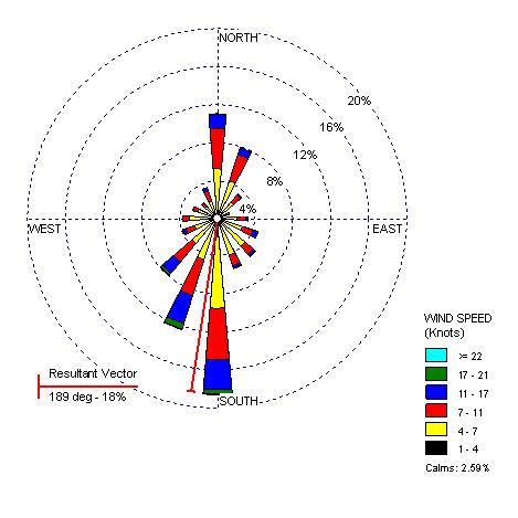
A wind rose is used to show the different data regarding wind. Meteorologist generally use a wind rose to identify different wind speeds and direction in a specific area. A wind rose is also an example of a circular plot.
Image found at: http://www.climate.washington.edu/windrose/Seattle-WindRose.jpg

Climograph

A climograph is used to show information regarding climates. These type of graphs are helpful when trying to learn an areas environment.
Image found at: http://www.washburn.edu/faculty/tfry/Climate%20article_files/image003.gif

Population profile

This population profiel is showing the percent of immigrant population in the U.S. in 2004.
The two different colors are showing the differences in males and females. Colors can also be used for age, race, religion, income, and more.

Scatter plot

This scatter plot is comparing husband's and wife's ages. Scatter plots are often used to statistically describe a trend. Each observation is represented by a dot.
Image found at: http://cnx.org/content/m10949/latest/age_scatterplot.gif

Index value plot


An index value plot represents information that happens over time. This plot is showing the viewer average stream flow from 2001-2008. The data spread over the normal line, shows the viewer that the stream flow has been quite average with a few ups and downs.

Accumulative line graph or Lorenz curve

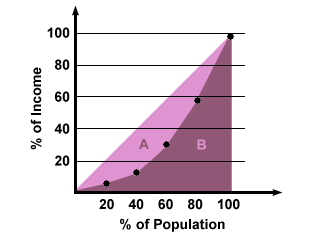
Here is an example of a Lorenz curve. Lorenz curves are often used to represent income distribution. The solid line is the Lorenz curve, which represents the actual distribution. Every point represents a statement, and every Lorenz curve has a Gini coefficient showing a line of perfect equality.
Image found at: http://img.sparknotes.com/figures/D/df794916738a067d0a15bbaeabcb81e3/lorenz.gif

Bilateral graph

This bilateral graph shows California's mortgage rate trends. The blue representing a 30 year fixed mortgage, and the green representing a 30 year fixed jumbo mortgage.
The left side of the graph shows the percentage rate at which the mortgage is fixed. Bilateral graphs show negative and positive values, and is made for the viewer to comprehend easily.

Nominal area choropleth map

This is an example of a nominal area choropleth map. This map shows predictions for Democrats v. Republicans during the 08 election. It is best to use standard colors when creating this map type, it helps to understand the material better.
Image found at: http://politicalmaps.org/wp-content/uploads/2007/12/2008-prediction-map-11252007.jpg

Unstandardized choropleth maps


This is an example of an unstandardized choropleth map. This map type does not have specific rankings or order.

Standardized choropleth maps

Here is an example of an standardized choropleth map. This map shows the percentage of people under the age of 14 in Canada. Standardized choropleth maps show one type of data, and allows the viewer to compare the criteria for different areas.
Image found at: http://www.statcan.gc.ca/pub/92f0138m/2008003/figures/figure3.1-en.jpg

Univariate choropleth maps


Here is an example of an univariate choropleth map. Univariate choropleth maps are used for single data information.

Bivariate choropleth maps

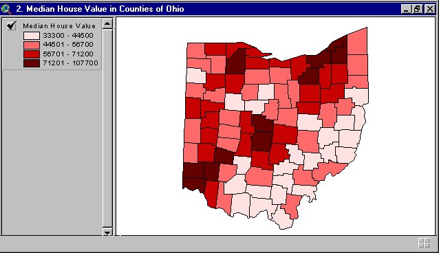
Here is an example of a bivariate choropleth map. This type of map is thematic, showing several different types of data; for example this map shows 4 different price ranges of housing in Ohio.

Unclassed choropleth maps

This is an unclassed choropleth map that shows fertility rates. An unclassed choropleth map using shadings to represent the data.

Saturday, August 1, 2009

Classed choropleth maps


Here is an image of a classed choropleth map. This choropleth map shows the amount spent in millions in overseas residents in Great Britian. These types of maps need to include a histogram and shading.

DEM

A Digital Elevation Model (DEM) shows raised geographic data. The DEM above shows the elevations of Lake Tahoe. DEMs are used in xyz coordinates, and use contour lines.

DRG


Here is an example of a digital raster graphic (DRG). This is a type of topographic map. DRG are used to collect, review and revise digital data.