Friday, July 31, 2009

Isopach

Here is an image of Isopach lines. This one shows sandstone quality created from well logs. Isopaches are used to elevations and differences in height. The pink area shows that the sandstone is about 45ft thick, and the green is 25 ft thick.
Image found at: http://www.cartage.org.lb/en/themes/Sciences/Earthscience/Geology/OilandGas/HydrocarbonExploration/GeologicMaps/SANDSTONE_MAP.jpg

Isohyets

Isohyets are another type of contour line. This image of Isohyets is showing the amount of rainfall in Tasmania. This shows lines of precipitations and rainfall.
Image found at: http://soer.justice.tas.gov.au/2003/image/265/water%20quantity/m-ilw_quantity_rainfall-l.gif

Isotachs

This is an image of isotachs on a map. Isotachs are a form of contour lines. This map shows the knots in Florida. Isotachs are used for weather purposes, mostly to measure wind.
Image found at: http://weather.cod.edu/help/700tach.gif

Isobars

This is an image of Isobars. An isobar is a line of equal or constant pressure on a map. The lines are drawn to represent equal lines of pressure. Meteorologists use these types of maps when practicing the weather and climate conditions.
Image found at:http://www.newmediastudio.org/DataDiscovery/Hurr_ED_Center/Hurr_Structure_Energetics/Closed_Isobars/Closed_Isobars_fig02.jpg

LIDAR

This is an image of Light Detection and Ranging (LIDAR). This LIDAR picture was taken above Kansas City. LIDAR shows an aerial view, that is also three dimensional. These types of images can be very helpful to tourist in an area.
Image found at: http://www.imagingnotes.com/ee_assets/email_images/Lidar_KansasCity_MJHarden.jpg

Doppler radar


This is another one of my favorite types of images. I look for it everyday on the news. This is Doppler radar. Doppler radar mostly used to show thunderstorms and rain in ones area. It also shows where clouds are at, at a certain time. I like the Doppler radar because it shows how close rain is, and how sever the storms may be. Doppler radar is also a good estimate of how much time you have before a storm hits your area. This image shows that rain is close to the Fort Myers area, and the red indicates that the weather is very severe.
Image found at:

black and white aerial photo

Here is an image of a black and white aerial photo. Aerial photos are a picture of a land mass or certain area from far above, such as a helicopter, air plane, or sky scraper. This one shows a highway in Kansas City, the roads and intersections stand out because they show more of the "white." While the ground underneath the intersection is dark, and less noticeable because it shows more of the "black."
Image found at:http://isaacalongi.com/wp-content/uploads/2008/11/black_and_white_aerial_photograph_of_kc.jpg

Infrared aerial photo


Infrared aerial photos are pictures of a product or land mass, the darker the colors, the more intense the area . In this case, this is an infrared aerial picture of a hurricane. The center of the hurricane (the eye) is red, and the dot in the very center is green, ...which means that these colors are the most intense area of the storm. There is also red in the outer layers of the hurricane, which shows that there are some intense storms beyond the center of the hurricane.

Cartographic Animations


This is seen all to much in Florida! What we see when a hurricane is coming on the local news is also called a cartographic animation. These type of maps are used specially for weather conditions and climate change.

Statistical maps

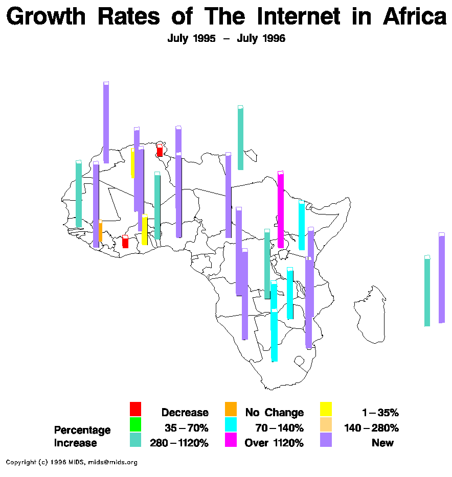
This is one of my favorite types of maps. Statistical maps, these are used to show statistics of various types. This one particular shows the percentage increases of Internet in Africa from July 1995-July 1996. The major growth was people and places that have newly received Internet access. Statistical maps can show any type of statistic in any area, some examples are college graduates, births, incomes, and pets.
Map found at:http://personalpages.manchester.ac.uk/staff/m.dodge/cybergeography/atlas/mids_af_i_gr_c_large.gif

Tuesday, July 28, 2009

Cartograms

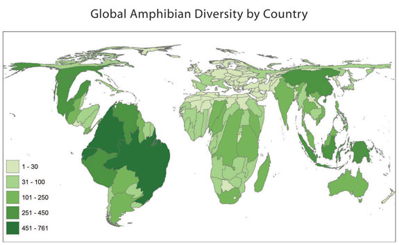
This is a cartogram of global amphibian diversity around the world. This is an illustration ofamphibian diversity and density. As the green color display darker, that shows that there are more amphibian in that particular area. Cartograms can be used to show a number of things across the world such as animal populations, emissions, census information, colleges and just about any thing.
Map found at: http://www.amphibiaweb.org/amphibian/cartograms/cart_global_diversity.jpg

Tuesday, July 7, 2009

Flow Maps

Flow maps are used to track different cases. In this case the map is showing the tracking of the West Nile virus. Flow maps can also be used to track immigration, politics (Democratic v. Republican), housing markets, test scores and much more.

Isoline maps


Here is an image of Isoline map. Isoline maps use lines that run together and show the same types of information within the lines, and often colors are used to show the differences in each section. This one shows the different temperatures of January's highs. starting at less than 40 degrees to greater than 32 degrees.