 This is one of my favorite types of maps. Statistical maps, these are used to show statistics of various types. This one particular shows the percentage increases of Internet in Africa from July 1995-July 1996. The major growth was people and places that have newly received Internet access. Statistical maps can show any type of statistic in any area, some examples are college graduates, births, incomes, and pets.
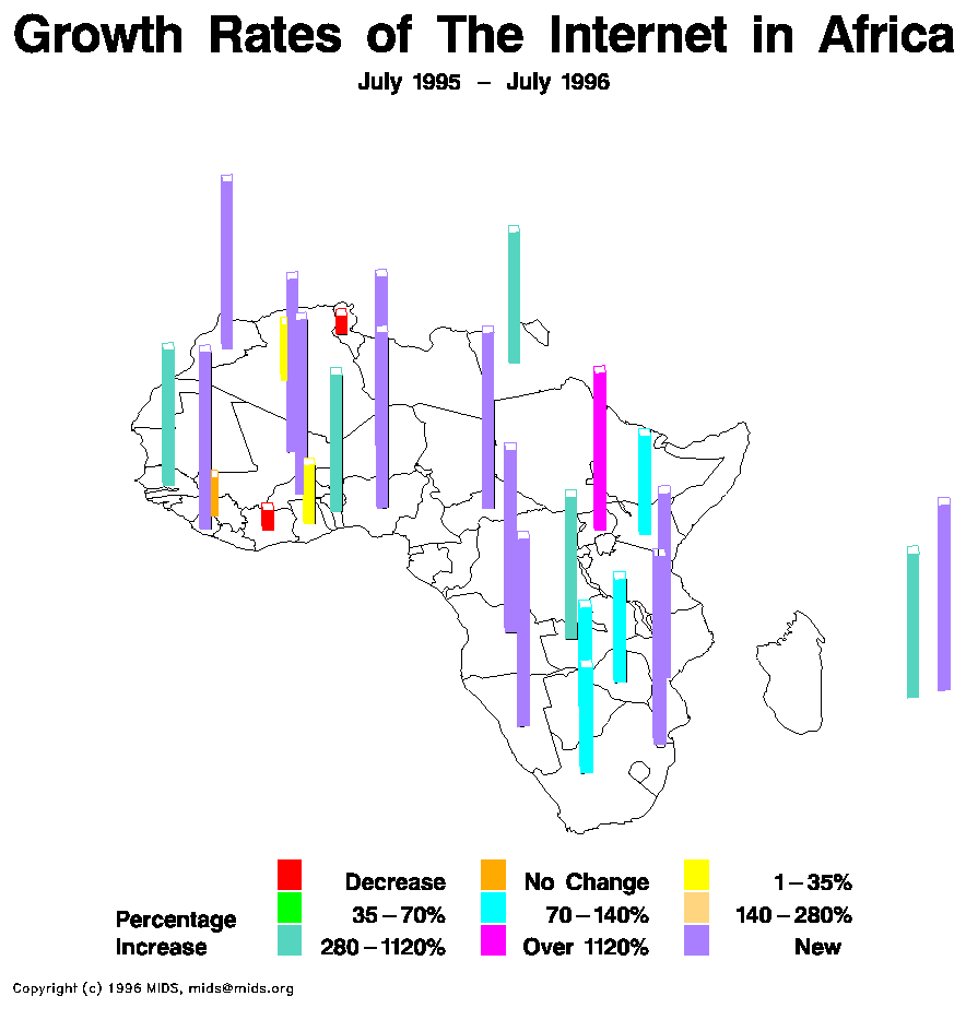
 Map found at:http://personalpages.manchester.ac.uk/staff/m.dodge/cybergeography/atlas/mids_af_i_gr_c_large.gif

No comments:
Post a Comment